Some businesses don't need a website to tell people they exist. Fluffy Fresh Donuts on Johnson Drive in Mission, Kansas has been frying the same family recipe for generations, and the regulars already know where to find it. So why build a new website at all?
Because the people who don't know about it yet are searching on their phones at 6:45 on a Saturday morning, and they need three answers fast: Is it open? Where is it? What do they have? A shop that sells out most mornings can't afford to lose those people to a slow page or an outdated menu.
What we built
We kept the site simple on purpose. A donut shop isn't a software company, and the website shouldn't act like one. Here's what's on it and why.
Hours and address up front
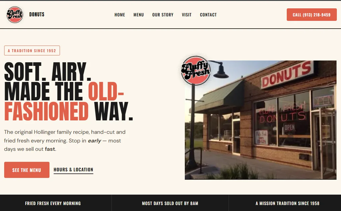
The shop opens at 5 AM, closes at 10 AM, and is closed Mondays. That's an unusual schedule, and it's an easy one for a first-time visitor to get wrong. The hours sit right on the home page next to the address and a link to directions. No digging through menus to find them.
A menu the owners update themselves
This was the big one. Prices change. Seasonal flavors come and go — right now that's pumpkin spice, caramel apple, and a chai latte cake donut. The fruit cake donut changes by the day of the week. On a lot of small-business websites, the menu is a photo of a printed sheet that nobody updates after launch day.
On the Fluffy Fresh site, the menu is real text that the owners edit from their own dashboard: name, description, price, and which section it belongs in. Adding a seasonal item takes about as long as writing it on the chalkboard. And because it's real text instead of a picture, Google can read it — so someone searching for "apple fritter near Mission KS" has a real chance of landing on the page.
One tap to call
The phone number is in the header on every page, and on a phone it's a button. Tap it and the shop rings. For a business where people call ahead to ask "do you still have any left?", that matters more than any fancy feature.
The story, told plainly
The "Our Story" page tells new customers what the regulars already know: hand-cut, fried fresh before sunrise, family run across multiple generations, and usually sold out early. That page isn't decoration. It's the reason someone drives across town instead of grabbing a box at the gas station.
A way for happy customers to say so
The home page shows customer reviews and has a button inviting people to leave one. Reviews help nearby searchers trust a business they've never visited, and they help the shop show up in local search results.
What we left out
No online ordering. No pop-up asking for your email. No auto-playing video. A walk-in shop that sells out by mid-morning doesn't need any of that, and every extra feature is one more thing that slows the page down on a phone. The goal was a site that loads fast, answers the three big questions, and gets out of the way.
The takeaway for other small shops
If you run a bakery, café, or any walk-in business, ask yourself:
Can a stranger find your hours in under five seconds on their phone?
Is your menu or price list current today, and can you change it yourself?
Can someone call you with one tap?
Does your website tell your story, or just list your address?
If any of those answers is no, you're probably losing customers you never knew about.
Want to see it in action? Visit fluffy-fresh.com — and if you're in Mission, get there early.