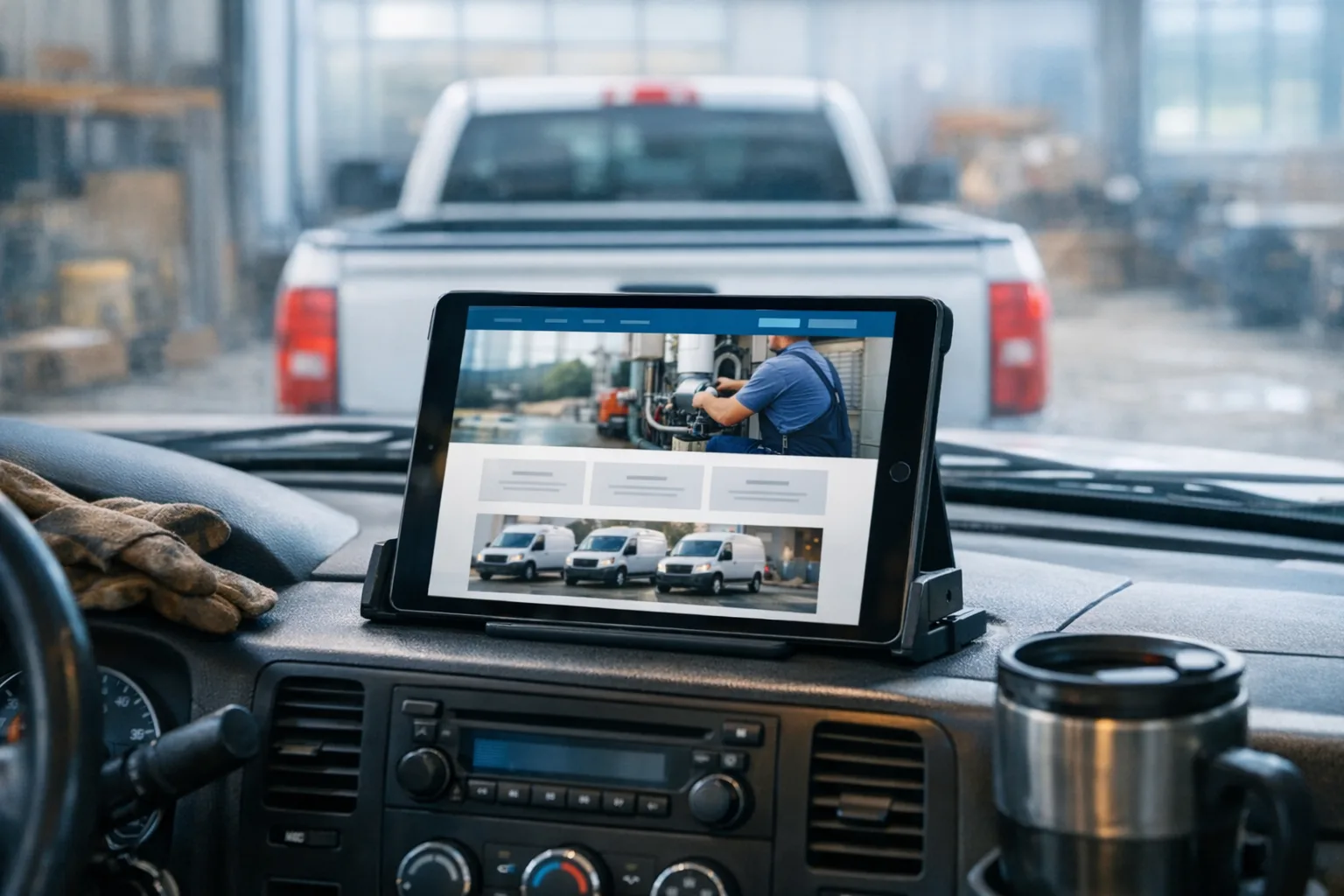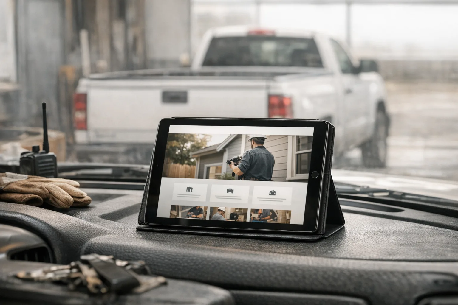
A homeowner taps your site from Google on a phone in the driveway. The page crawls in, a giant stock photo covers the screen, and the first words they see are something like “quality solutions for all your needs.” No phone number. No service area. No clear answer about whether you install water heaters, rewire panels, or pour driveways.
That is usually the moment the homepage fails. For a service business website, the homepage does not need to win awards. It needs to tell a busy person, quickly and plainly, “Yes, you’re in the right place, we do that work, we serve your area, and here’s how to reach us.”
What should the homepage do first?
The homepage should answer the customer’s first four questions without making them hunt.
Those questions are simple:
- What do you do?
- Where do you work?
- Can I trust you?
- How do I contact you right now?
If those answers are buried in sliders, vague slogans, or a menu with seven choices before breakfast, the homepage is doing too much of the wrong work.
A good homepage for a plumber, electrician, contractor, or excavation company is not a brochure cover. It is more like a front counter. The customer walks up, looks around for five seconds, and decides whether to stay.
That means the top of the page needs a plain headline, a short explanation, and an obvious next step. Something like the actual service, the actual town or service area, and a call button or quote request. Not poetry. Not “serving excellence.” Just the truth, stated clearly.
What needs to be visible without scrolling much?
Your phone number, core services, service area, and contact path should be easy to spot right away.
On most service sites, the top section should include:
- business name
- a short headline that says what you do
- service area or cities served
- phone number or tap-to-call button
- a clear button for quote requests or contact
If you offer emergency service, financing, free estimates, or a specific specialty, that can belong here too, but only if it is real and important enough to affect the call.
The mistake I see a lot is treating the homepage like a billboard instead of a working page. A billboard can get away with one message. A homepage has to do a few practical jobs at once.
For example, an electrical contractor’s homepage might need to show residential service, panel upgrades, lighting, and troubleshooting near the top, because those are common reasons someone landed there. A general contractor may need to make it clear whether they handle kitchens, additions, decks, or commercial work. A real estate site has a different set of priorities. The point is not to list everything ever done. The point is to make the common jobs easy to recognize.
Why do so many homepages feel generic?
Most generic homepages come from templates, stock content, and missing maintenance.
That sounds harsh, but it is usually not the owner’s fault. A lot of websites get built from the same pre-made theme, then filled with industry copy that could belong to any company in any state. The photos are smiling strangers in clean uniforms. The text says “trusted professionals” five different ways. The layout was designed to impress another designer, not help a homeowner pick up the phone.
Underneath that, there is often a pile of moving parts the owner never asked for. A page builder, a form plugin, three add-ons for the gallery, something for popups, something for backups, something for caching, something for security. Each one may be useful by itself. Together, they can turn a simple homepage into a machine with too many belts and pulleys.
What actually goes wrong?
Heavy image files slow the first load. Extra plugins load extra scripts, which are little code files the browser has to download and run. Fancy animations delay the moment a customer can read anything. Old plugins stop cooperating with newer software. Contact forms quit sending. Hours stay wrong because nobody updates them. The homepage still technically exists, but it stops doing its job.
This is one reason I prefer hand-built pages over templates and page builders. Not because those tools are evil. They are not. They are just often sold as if they have no tradeoffs, and that is not true. When we build a site by hand, we can keep the homepage lighter, simpler, and easier to maintain. If you want to see how we approach that, our custom website design process is built around service businesses, not generic layouts.
What content actually belongs on the homepage?
The homepage should cover the basics well, then point the visitor to the right next page.
Here is what I would expect on most service business homepages.
First, a clear opening section:
- what the company does
- who it serves
- where it works
- how to get in touch
Then, a short services section. Not a giant wall of text. Just the main categories with links to the deeper pages.
After that, trust signals. This can be licenses if relevant, years in business if accurate, review snippets if they are real, before-and-after work photos, badges for associations, or a short note about how the company works. Real photos of your own jobs matter a lot here. They do more for trust than a dozen stock images of perfect kitchens nobody on your crew has ever seen.
Then add practical details. Service areas. Hours. What kinds of jobs you take. Whether estimates are available. Whether you serve residential, commercial, or both.
Finally, end with another clear contact section. Some people decide early. Some read halfway down. Some scroll to the bottom looking for the phone number because that is how all of us behave when we are tired.
If local search matters, and for most service businesses it does, the homepage should also support that with clean page structure, fast loading, and accurate location details. Good local SEO that ships with every build is not magic. It is the boring, important stuff done correctly: clear service pages, location relevance, proper page titles, structured data, and consistent business information.
How can you judge your own homepage honestly?
Open it on your phone using cell data and pretend you are a new customer.
Not your office Wi-Fi. Not your desktop with three giant monitors. A normal phone, normal signal, normal level of patience.
Check these things:
- How long before you can read the main message?
- Is the phone number obvious?
- Can you tell what the business does in one glance?
- Can you tell where the business works?
- Are the photos clearly your team, your work, or your trucks?
- Are the hours current?
- Does the contact form actually work?
- How many taps does it take to request a quote?
Then ask one customer or one non-technical friend to look at it for thirty seconds. Ask what they think you do, where you work, and what they would click next. Their answer is usually more useful than your own, because they are not filling in the blanks from memory.
Another good test: count the clicks it takes to find basic information. If your phone number is hidden, your service area is buried, and your main services live in a dropdown inside another dropdown, the homepage is making the customer work too hard.
Are DIY builders and WordPress always the wrong choice?
No. They are workable tools, but they come with costs that usually show up later.
For some owners, a DIY builder is the only thing that gets a site online. That is a real advantage. WordPress can also be fine in the right hands, especially if someone is actually maintaining it. The trouble is not that these tools exist. The trouble is that people are often sold the easy part and not warned about the maintenance part.
Those costs can include slower pages, plugin conflicts, awkward editing, limited layouts, and dependence on one person who knows where all the switches are. Sometimes the owner finds out years later that changing one homepage section means fighting a page builder full of mystery boxes and broken spacing.
A small business website redesign is often less about making the site prettier and more about getting rid of those hidden costs. Fast pages, clear content, and simple editing tend to age better than elaborate layouts.
That is also why we give owners a clean dashboard to update text, photos, service areas, and posts themselves without touching code. And if we host the site, the ongoing work is covered in one place: SSL, CDN delivery, daily backups, security patches, uptime monitoring, and platform improvements that roll out across every site we manage. You can read more about that on our hosting and management page.
What does “good” look like for a business your size?
For most local service businesses, good means clear, fast, current, and easy to contact.
It does not mean endless features. It does not mean a giant homepage full of motion and effects. It does not mean writing a novel about your company history.
If you have a small crew and a local service area, a good homepage should make a homeowner comfortable calling you. It should load quickly on a phone. It should show real work. It should explain the main services in plain English. It should make contact easy. And it should be easy for you to update when your hours, service area, or offerings change.
That is enough. Honestly, that is more than a lot of sites manage.
This week, take ten minutes and audit your homepage on your own phone. Write down the first three things that are unclear, out of date, or too hard to find. Fix one of them now. If your phone number is buried, move it up. If your photos are generic, start gathering real ones from recent jobs. If the homepage still could belong to any company in any county, that is the part to change first.