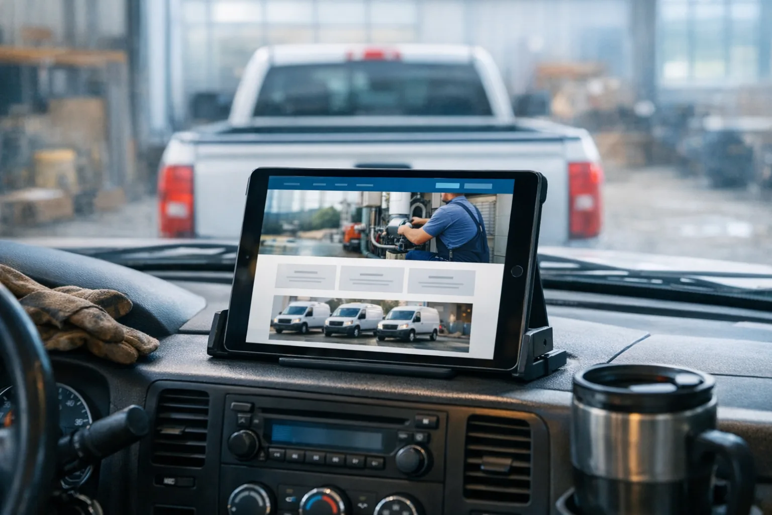
Your site loads fine on the office Wi-Fi, but on a phone in a driveway it hangs long enough to feel broken. The contact page still lists hours from two winters ago. The homepage says things like “quality service” and “trusted professionals,” which could belong to a plumber, an electrician, or a roofer in any state.
That is usually when an owner tells me, “We paid for a custom website.” Sometimes they did. A lot of times, they paid for a template with their name dropped into it. The word custom website gets used so loosely that it has stopped meaning much unless someone explains what was actually built.
What “custom website” should mean
A custom website should mean the site was designed and built around your business, not around a pre-made layout somebody reused. That does not mean “fancy.” It means the structure, content, photos, calls to action, and admin tools fit how your company actually works.
For a service business, that usually shows up in simple, practical ways:
- the phone number is easy to find without hunting for it
- the service areas are spelled out clearly
- the site answers the questions customers ask before they call
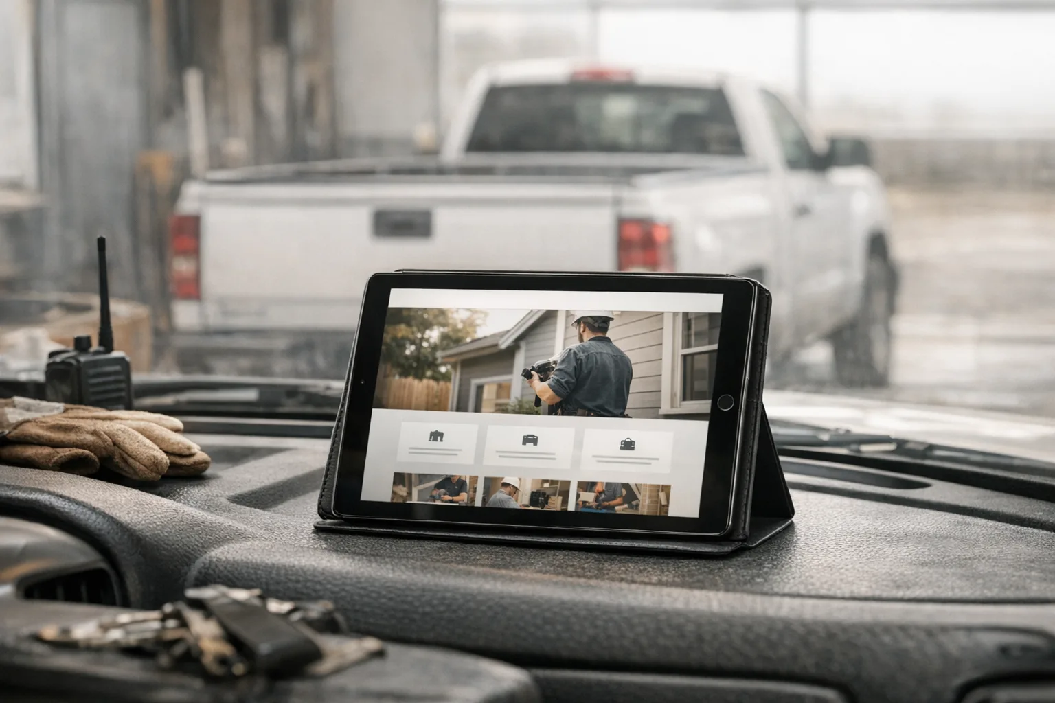
- the photos show your crew, trucks, jobs, and work quality, not a smiling stock family in a kitchen nobody owns
- the pages are built for a thumb on a phone, not a mouse on a big monitor
Under the hood, custom also means the site is not leaning on a pile of rented parts just to function. If changing one form plugin breaks the quote request page, or one expired add-on takes down the whole contact flow, that is not much of a custom build. That is a stack of dependencies with your logo on top.
How agencies water the word down
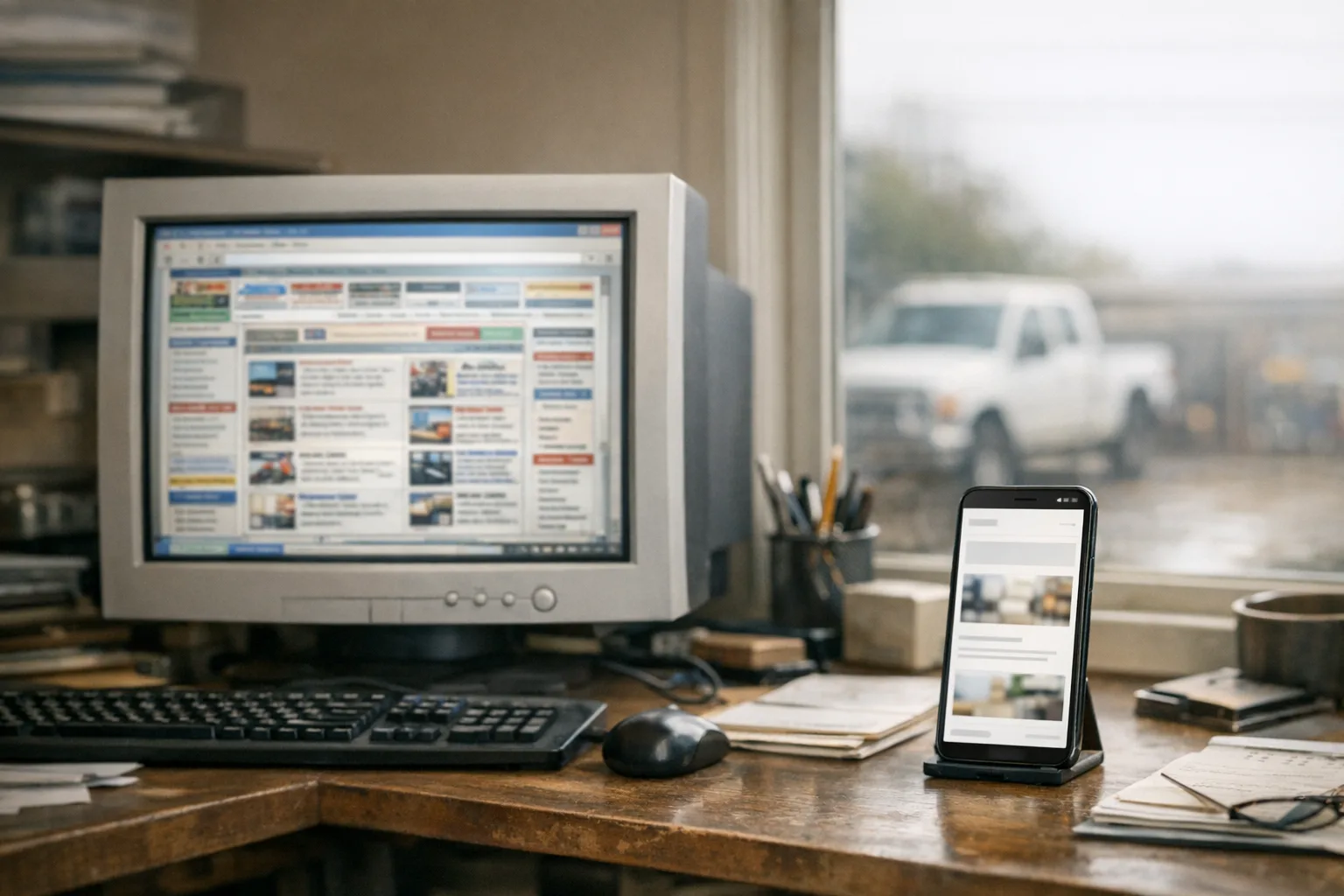
They usually water it down by calling the content custom when the system is not. In plain English, they start with the same theme or page builder they use for everybody, swap colors, replace a few sections, and call the result custom because the text mentions your town.
I have inherited a lot of these sites. They often have the same pattern underneath:
- a theme bought once and reused over and over
- a page builder, which is a visual drag-and-drop layer used to assemble pages
- a long plugin stack handling forms, backups, security, SEO, sliders, popups, and image compression
- stock photos because nobody planned for real jobsite photography
- old copy carried over from the last redesign because rewriting it takes work
- no one assigned to maintain it after launch
None of those tools are automatically bad. The problem is what happens over time.
A plugin stops being supported. A theme update conflicts with the page builder. The mobile menu gets weird after a software update. Images are uploaded far larger than they need to be, so the homepage makes a phone chew through a lot of data before the customer even sees your number. The contact form still “looks” fine, but submissions quietly stop reaching the inbox.
From the owner’s side, it feels random. “It was working before.” Usually it was. Then the person who built it moved on, and nobody was left doing the small, boring maintenance that keeps a site from drifting into trouble.
What is actually making a bad site feel bad
Usually it is not one dramatic failure. It is a pile of small mechanical problems that add up.
The homepage hero image might be oversized, so a phone has to download more than it should. There may be three scripts, meaning little chunks of code, loaded for animation effects nobody asked for. A page builder may generate bulky markup, which is the code structure of the page, so the browser has more work to do before showing anything useful. A third-party font might delay text from appearing. A map embed, review widget, or chat tool might load before the main content.
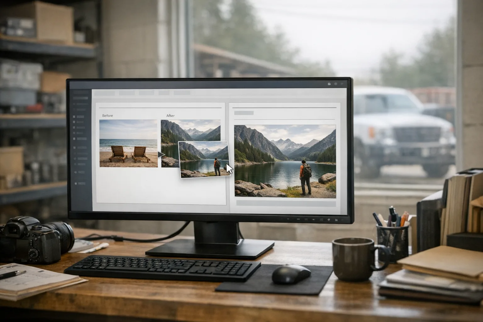
Customers do not diagnose any of that. They just feel it. The page seems slow. The layout jumps around. The text is tiny. The button is hard to hit. The before-and-after gallery crops wrong on a phone. The service area is unclear. The site feels generic, so the company feels generic.
That is the quiet problem with a watered-down custom build. It may not look terrible in a sales demo. It just slowly becomes annoying to use, expensive to maintain, and forgettable to the person trying to hire you.
How to judge your own site honestly
Start with your phone, on cell data, not the office computer. If you want a real read on your mobile-friendly website, test it the way your customers actually see it.
Check these things in order:
- How long does it take before you can read something useful?
- Can you tap the phone number immediately?
- Can you tell what services you offer without scrolling forever?
- Is your town or service area obvious?
- Do the photos look like your business or like everybody else?
- How many taps does it take to request a quote?
- Does the form ask only for what you truly need?
- Are your hours, team, and service list current?
Then ask one customer who is not related to you to look at it for a minute. Not a marketing person. Just a normal customer. Ask, “What do you think this company does, and would you call them?” You will learn more from that than from an analytics dashboard you never wanted in the first place.
One more useful test: pretend your water heater just failed, or your panel needs replacing, or you need a trench dug this week. Search your business name, open your site, and try to contact yourself with mild irritation. If your own site slows you down, it is slowing other people down too.
DIY builders and WordPress have real uses, but they also have real costs
They are not evil. They are tools. For the right situation, they can be perfectly reasonable.
A DIY builder can be fine when a business is new, cash is tight, and the goal is simply to get a clean brochure site online. WordPress can also be fine, especially when it is built carefully and actively maintained by somebody who knows what they are doing.
The issue is that owners are often sold only the easy part.
They are told they can update everything themselves, which is true in theory and less true at 7 PM after a long day. They are told the platform is flexible, which is also true, but flexibility often means more moving parts to maintain. They are told the site is custom, when the actual custom part is mostly the headline text.
The costs usually show up later:
- updates that need attention so things do not break
- forms that need testing, not just trusting
- image sizes that need managing so pages stay fast
- old staff photos, service areas, and hours that quietly go out of date
- design limits that make every change feel like a workaround
- handoffs between the designer, host, and maintenance person when nobody owns the whole thing
That is why I prefer a simpler stack. When we build a site, it is hand-designed, with no templates and no page builders, and it is designed mobile-first because that is how most people will judge it. Owners still get a clean admin dashboard they can use to edit text, photos, service areas, and posts without calling a developer, but the public site itself is not assembled from a tower of plugins and visual builder blocks.
What good looks like for a local service business
Good is not a flashy homepage. Good is a site that feels trustworthy in under a minute.
For a business of your size, a good website for service business work usually looks like this:
The site loads quickly on a phone. The top of the page says exactly what you do and where you do it. Real photos show your work, not generic stock scenes. The phone number is easy to tap. The quote request is simple. Each main service has its own page. Service areas are clearly listed. The site owner can make normal updates without opening a support ticket for every sentence change.
Good also means the site is maintainable. Hosting should cover the parts owners should not have to think about every week: SSL, which is the security certificate that puts the padlock in the browser; CDN delivery, which helps files load efficiently from locations closer to the visitor; daily backups; security patches; uptime monitoring; and the platform improvements that keep sites current over time. That is the difference between a launch and an actual system. If you want to see what that includes, our hosting and management service starts at $50/mo and is handled by the same people who built the site.
On the build side, a real custom job should be scoped to the business, not dropped into a package with three preset layouts. Our custom website design for service businesses starts at $600, and we scope it based on the size and complexity of the company. Design, copywriting, content setup, SEO configuration, and launch are part of the build, and most sites launch in 2 to 4 weeks.
One practical step to take this week
Open your site on your phone with Wi-Fi off. Give yourself one minute to find the phone number, confirm your service area, and submit a quote request.
If anything feels slow, vague, outdated, or harder than it should be, write down exactly where that happened. Not “the website is bad.” Write, “phone number was below the fold,” or “contact form asked too much,” or “homepage photo looked fake.” That short list will tell you more about whether your site is truly custom, maintainable, and worth keeping than any sales pitch will.